
The purpose of the Attache' tool was to manage photo attachments for sharing to supplement the Task internal ticketing system. I joined the project with the prospect of modernization and an emphasis on efficiency. This project was a second-change attempt, picked up during the annual Meta Hackathon, and previously started by a different team, so there were assets to build (and improve) upon.
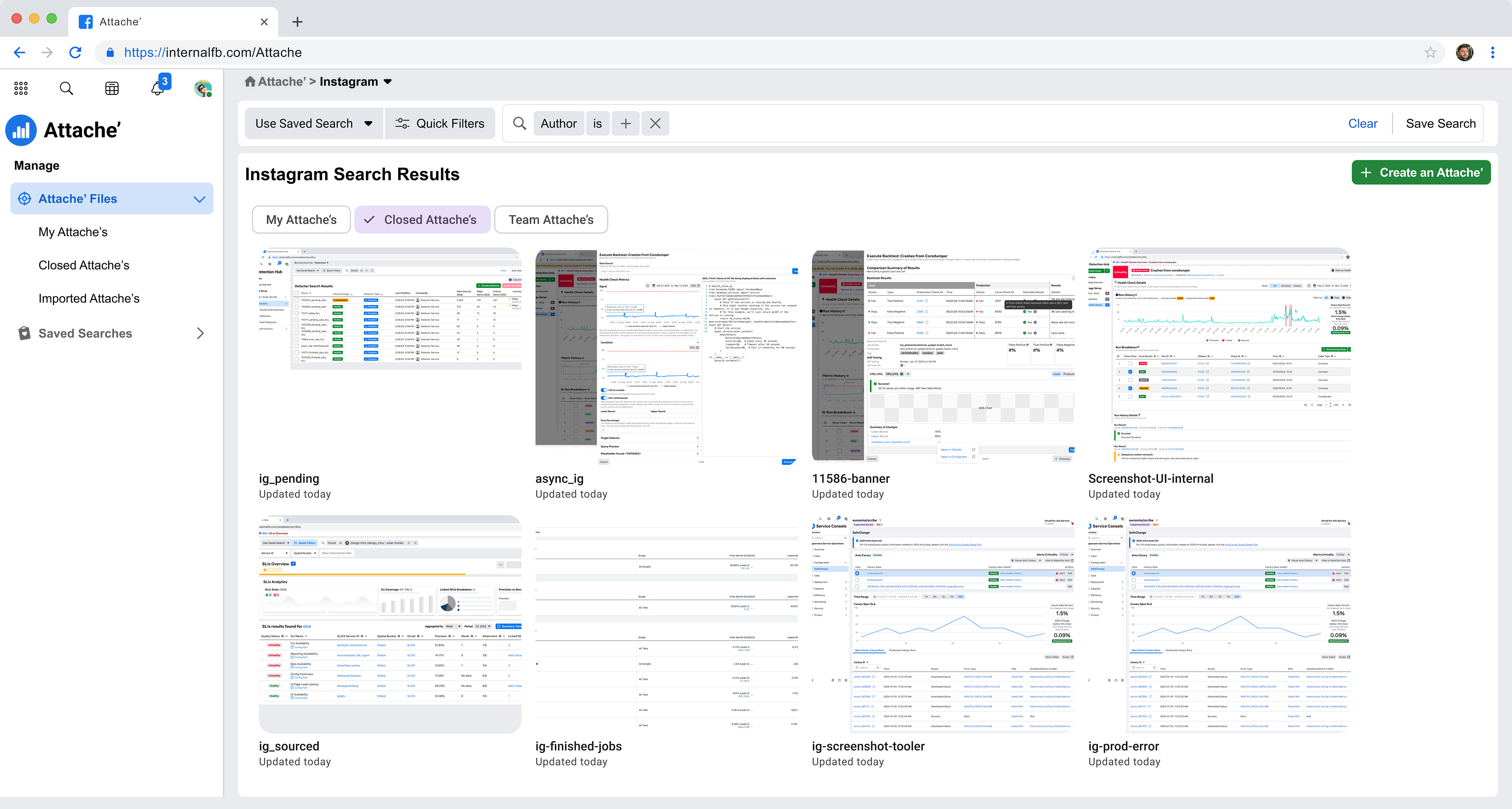
Attache' (before) - Main Search Results
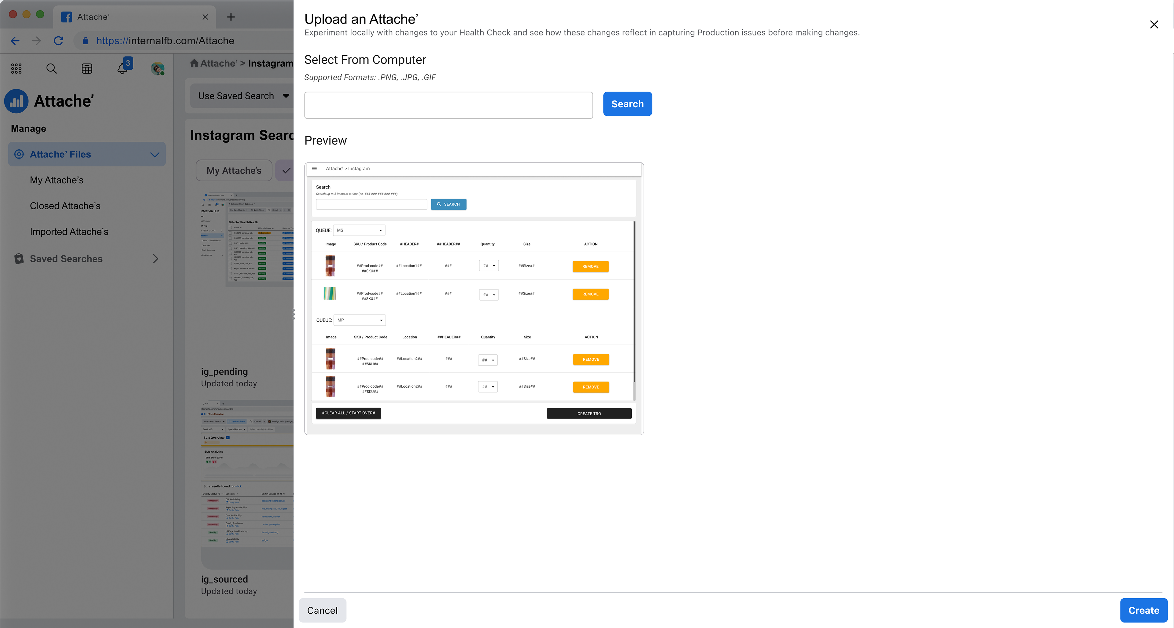
Attache' (Before) - Creating a new asset
Approach
From day one I approached the project as an exercise in long-term iteration with a slow-approach towards solving immediate design issues - this was due to the limitations of Engineering support to clear the backlog and the fact that there was no immediate drive for an overhauled MVP.
We needed to deliver immediate experience improvements that provided "quick wins" while also establishing Attache' as a more usable and friendly digital asset manager for the Task tool.
First Steps: Stakeholder Workshops and Surfacing Previous UX Research
My first step included holding multiple workshops with stakeholders to determine what these immediate "quick wins" could be in terms of delivering an updated overhaul of the product. Initially I met with everyone including the "big picture" people to get a sense of expectations. Then met with a smaller "cohort" of individuals who I considered the "boots on the ground" stakeholders.
I also read-through any previous research that was held to identify legacy features that we needed to sustain, and see where potential gaps in the evolution happened to contribute to the design backlog.
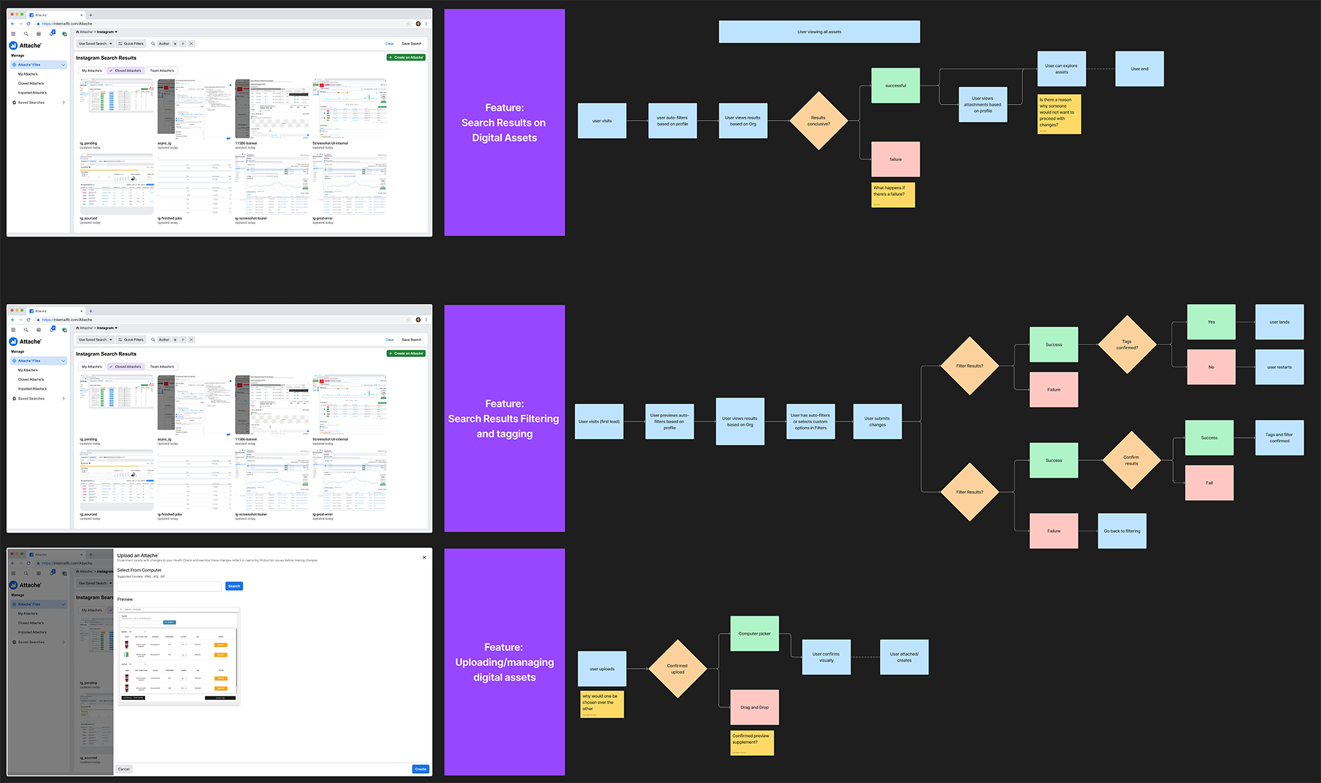
Workshop Results: mapping main features and decision-based journey(s)
Quick Wins
Through this effort it was determined that we could immediately improve upon:
1. Cleaning up the UI to make it more engaging by limiting white-space and updating the "feel" of it, since users reported that it seemingly looked too much like a data dashboard then a digital asset manager.
1. Cleaning up the UI to make it more engaging by limiting white-space and updating the "feel" of it, since users reported that it seemingly looked too much like a data dashboard then a digital asset manager.
2. Offered more surfaced actions on each digital asset because users complained about having to click multiple levels down to be able to share the asset with the Task management system.
3. Users were motivated by being able to categorize their assets and needed filtering ability to be featured.
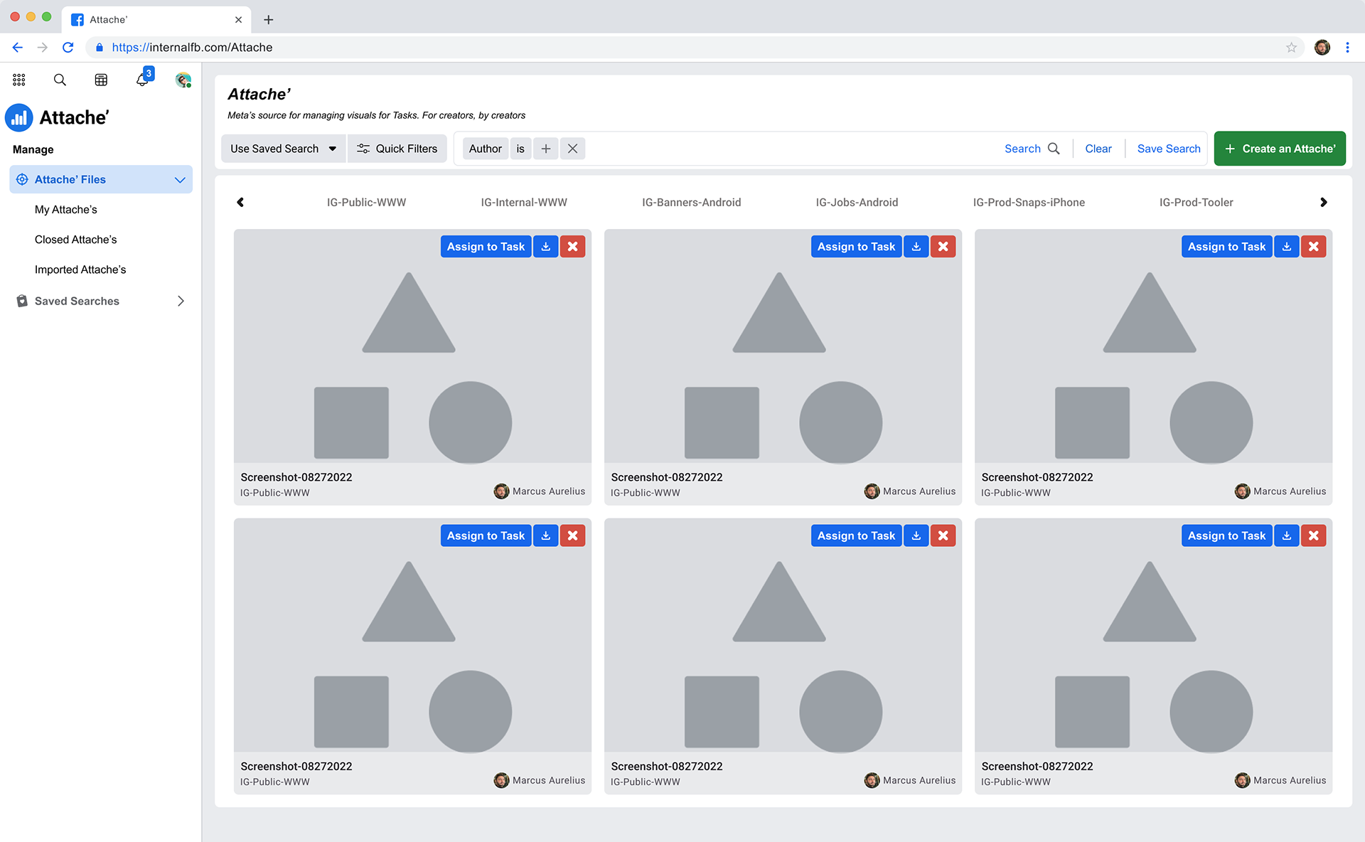
Wireframes surfaced actions on each Attache' (Assigning to a Task, Download, and Remove). The Name, Filtering tag and author were also overlaid onto the screenshot to minimize whitespace. Visual contrast risks were mitigated by including a background 50% differential to provide clarity.
User Testing Wireframes
A small sample of 18 users were selected to preview the wireframes and gather feedback. The hypothesis was to test if these simple "quick win" improvements to clear out the design backlog were effective enough to attached Engineering efforts behind the upgrades.
Response:
Overall the response to these upgrades were relatively lightweight. Of the 18 users included in the sessions, only 12 were able to effectively join in the conversation and provide ample feedback - however that sampling provided a generally positive attitude towards the improvements. Users reported that surfacing the actionable items on each Attache' helped them take more-immediate action when providing clear context of the Tasks. They also reported that while it was helpful to be able to download the Attache', it was probably not often necessary and not as important as being able to assign the asset to a Task.
Armed with this, I approached Engineering with confidence knowing that these improvements would enhance efficiency and we could get it on the Hackathon roadmap.
Hi-Fi Search Design Upgrades
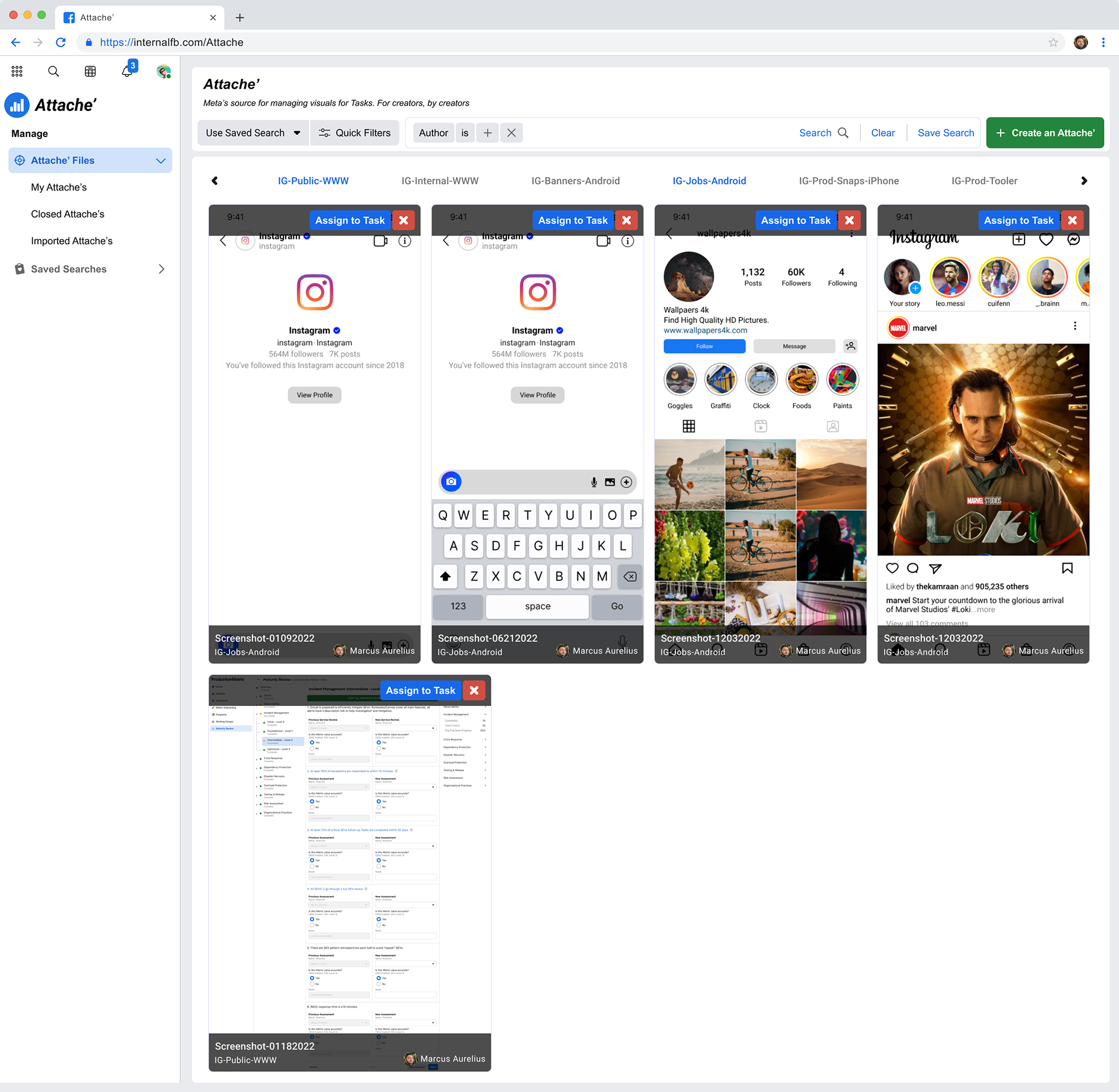
Hi-Fi designs for the Search Results: Clarified the filtering categories by tagging the active options with a bright blue to denote being active. Adjusted the background color and text on each Attache' meta details object to pass ADA standards.
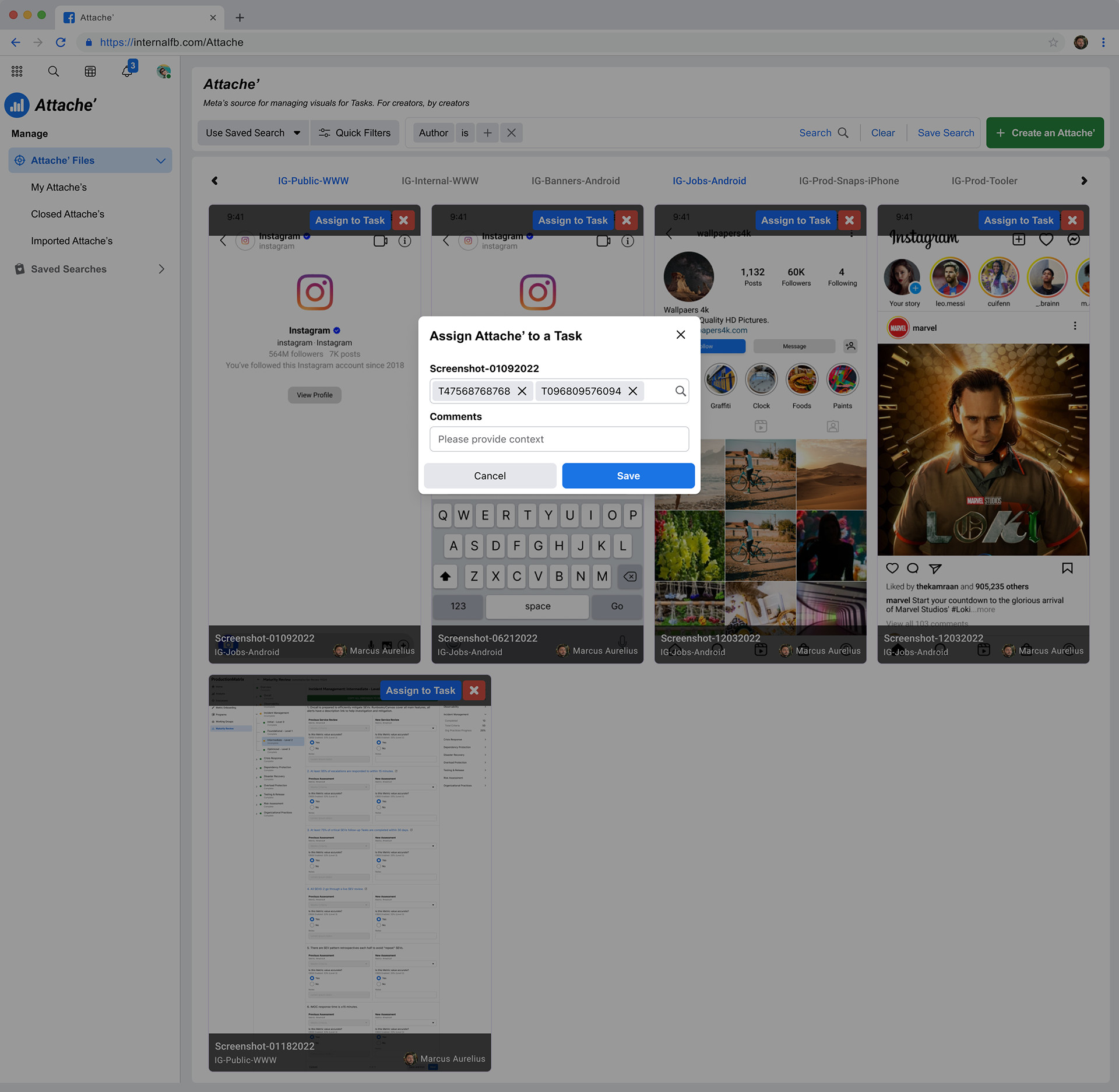
Action Popup Modal: Assign an Attache' to a pre-existing Task
Next Steps
Before proceeding further with upgrading the design work we had to consider that the project lived inside of the Hackathon timeline, and engineering efforts had to come to a halt momentarily because we had run out of time to get to MVP.
Using the feedback gathered during the initial MVP (from the previous Hackathon) and the subsequent UXR from the wireframing stage, I continued design work on Attache while it remained in a holding pattern due to the Hackathon timeline coming to an end. In the end the product was not released widely to Meta.