
Problem Statement - Working Against the Clock
The current CI/CD (Continuous Integration/Continuous Deployment) experience at Meta made it difficult to reason about what had shipped, what was still building, and how changes propagated. Engineers who were tracking their Releases or mitigating deployment failures had to navigate two separate pages (named Build and Ship) in the Conveyor tool, to understand what was happening during the full lifecycle. This made it difficult to reason about what had shipped to Production, what was still "building" (aka in-process), and how those changes propagated through multiple pipelines or regions. Additionally, it bogged down engineers when responding to deployment failures because they had to "roam" around the tool to find the appropriate data points in order to take action.
In addition, the current method of “hot fixing”, which is a method of injecting a quick fix to stop a failing Release, only existed in the CLI (Command Line Interface).
Engineers had to navigate across the spectrum of disorganized architecture in Conveyor, then jump into their CLI to inject a Hotfix to stop whatever was happening with a quick fix.
In moments of mitigation, every second counts due to potential revenue loss.
Solution
The goal was to merge the fragmented workflows in Conveyor (Build and Ship); into a unified view to improve traceability, decision-making, and overall reliability. A secondary goal to supplement this effort towards de-fragmentation was to adapt the quick-fix "Hotfix" flow into something more UI-centric.
Intended Impact - Everything in One Place, Time Saves Money
The redesigned Conveyor interface will shorten the timeline for mitigating failures; allowing Engineers to work more efficiently, reduce user toil by introducing the Hotfix flow during mitigation events (with ability to track those Hotfixes immediately in the UI), and increase overall security in deployment safety by Deployment-management teams. It will also allow Engineers to find everything in one place instead of having to traverse the complicated architecture of the tool. They will no-longer need to access the CLI for emergency Hotfixes, and can avoid combing through questionably-dated documentation for solutions in high-stakes time-sensitive deadline timeframes.
By consolidating fragmented workflows, the tool now supports more Services, surfaced deployment stages in a more efficient manner, and aligns with users' mental models—enabling clear, end-to-end visibility.
Context
Meta’s Infra organization manages the deployment of thousands of daily changes across services. Conveyor is an internal tool that helps engineers assess the safety of their changes in a continuous integration and deployment cycle; before pushing to production.
Meta’s scale and reliability goals require high levels of visibility into deployment activity. Conveyor is part of Meta’s broader investment in reducing engineering toil and avoiding regressions by improving continuous automation.
Current State of Things:
Conveyor’s experience is currently fragmented and confusing. Users struggle to understand how features relate to each other. The separation between editing a change in the "Pre-Landing" phase, and the additional "Post-Landing" flow when it lands in Production; disrupts the sense of a cohesive workflow. Multiple, scattered entry points can trigger a Release, but all lead to the same outcome which causes unnecessary complexity. The disconnect between the "Build" and "Ship" sections also lead to confusion, with users unsure why nothing appears to be actually shipping to Production.
In summary, Conveyor’s fragmented structure and lack of workflow cohesion make it difficult for users to track progress, understand feature relationships, and confidently navigate the release process end-to-end.
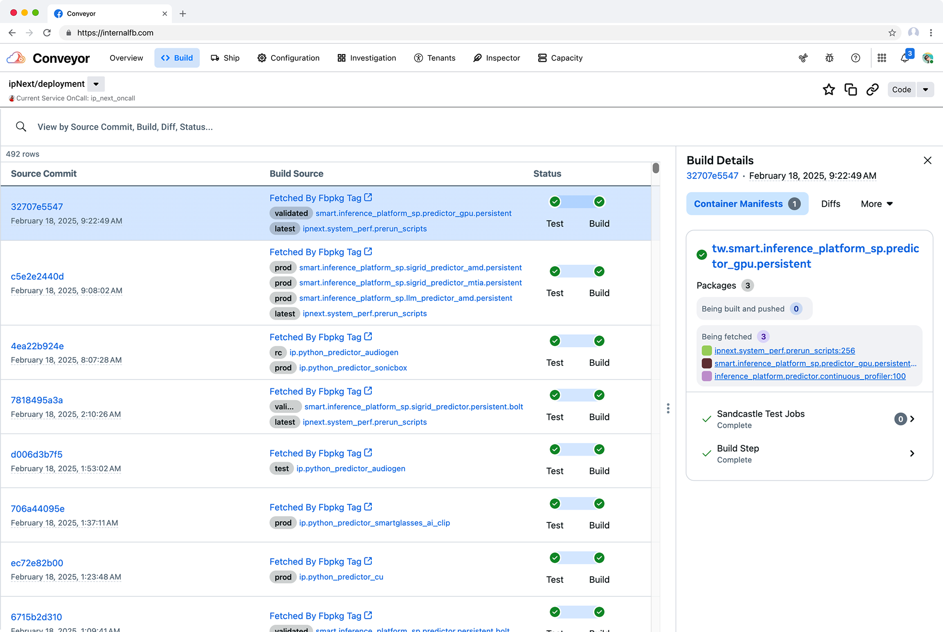
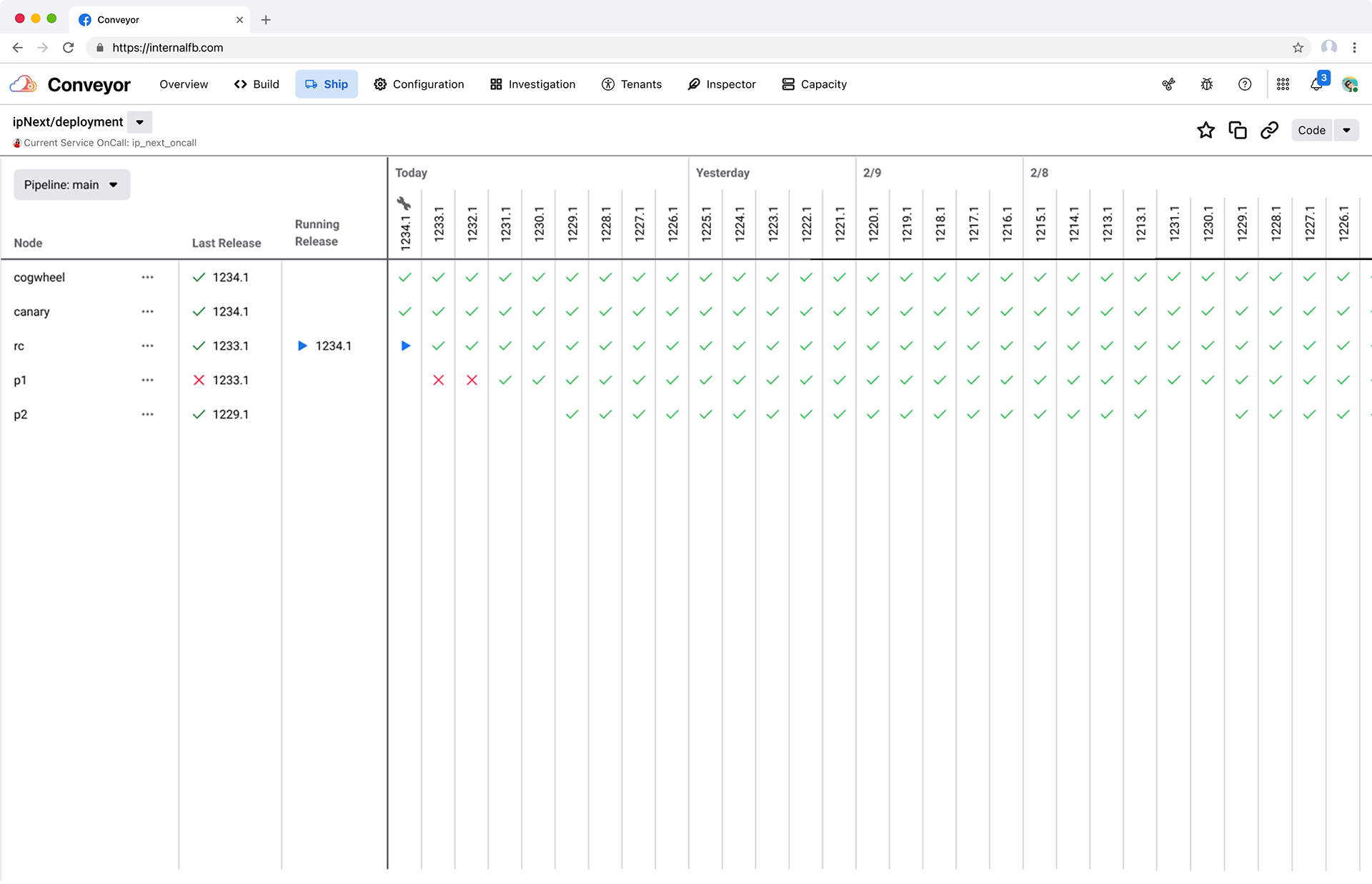
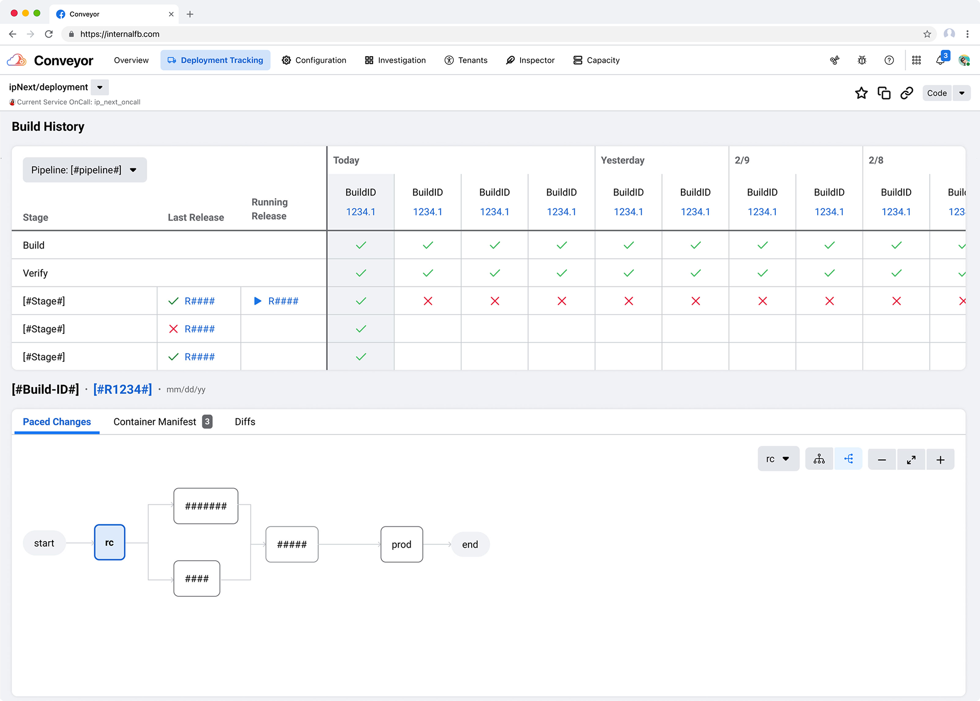
The Build section exposes an individual Commit, sorted by time stamp, and shows an abbreviated status of the Commit in two phases along with minor details of the artifacts associated with that Commit. The Ship section is a timeline of Releases exposing the performance status and activity of that artifact as it moves through the deployment process from creation to post-land.
(See below)
(See below)
Early Challenges
Merging these views promised clarity but surfaced several challenges during the early kickoff with stakeholders. Both the Build and Ship pages already took more than 60+ second to load in the UI, the data model propagating the UI was extremely complex, and there was ambiguity in the purpose of some Releases (they could be an emergency fix, or a general non-emergency change, or a false positive..).
In order to uncover and solve for the general ambiguity of the space I suggested a early focus on the performance of both Build and Ship pages to land immediate impact while running a feature-based UXR panel to enable the impending designs.
Research Process
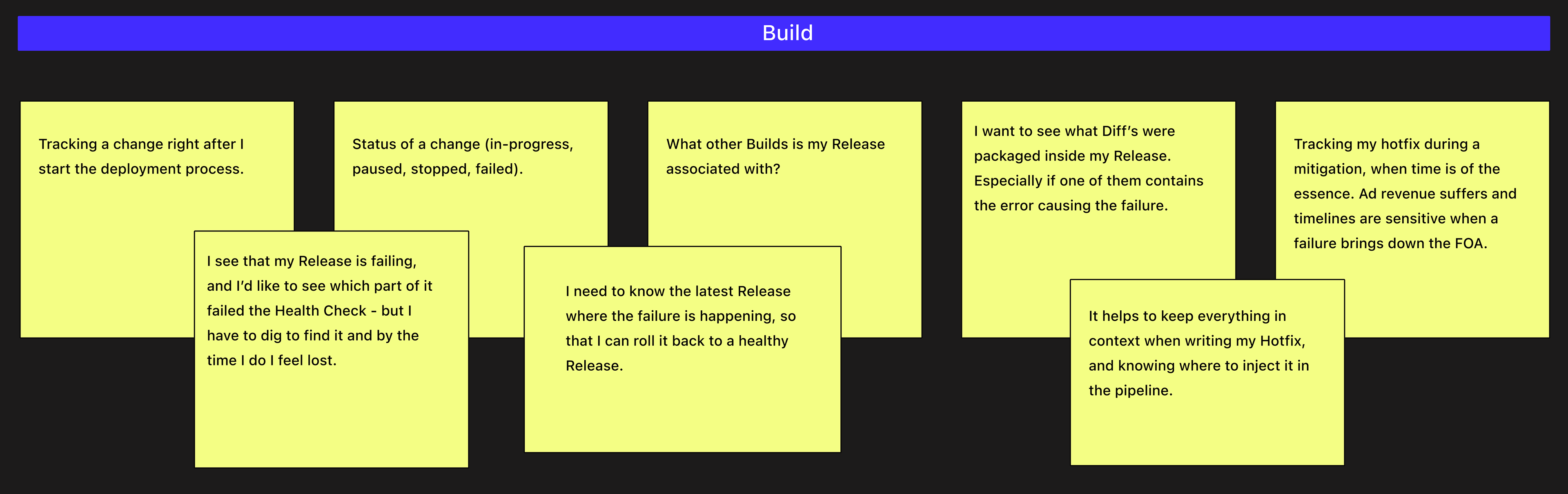
I partnered with PMs and Engineers to gather historical usage patterns, support tickets, and internal feedback. I reviewed logs; examined the use-cases between managing Builds and Releases; and ran user interviews to understand how users traced the creation-to-landing path in real workflows. Users heavily communicated a sense of confusion when monitoring their deployment, unsure of where exactly they needed to be in the tool, so they would open both the Build and Ship Page in two different windows to toggle between them.
Fragmentation Leading to Cohesion
Research also revealed that "...there's little understanding in how the features are related to each other" [User 4] which gave signal in terms of architectural fragmentation. Users also reported that "Conveyor is one long process chopped into two parts: editing (pre-landing a change) and monitoring (the post-landing) a change. Ideally it would be one long process" [User 12]. There was also a shared mental modal in general sentiment that "...all of the separate features in separate sections...lead to the same result" [User 9]; so potentially merging both the Build and Ship sections would create better cohesion and comfort in serving that mental modal.
Affinity Map Follow-Up
A quick affinity map activity in a follow-up session with all 13 users confirmed that the capabilities and data presented in both Build and Ship pages should be coupled together "...because it made more sense about their relationship, and I could see where everything is" [User 7]. Additionally, most users were enthusiastic about having immediate access to Hotfix a change in Conveyor when responding to (or trying to mitigate) a failure.
Design Process - Exploration
The research findings were organized into two categories - quick wins with high-impact value, and "heavy-lift" improvements that would need more analysis and input from engineering efforts. The next phase involved a level of wireframing with stakeholders because even though the user feedback encouraged merging "Build" and "Ship" together; along with building the new Hotfix feature; we'd still need to solve for some ambiguity surrounding the data model relationships on the API layer. I also like to incorporate the wireframe phase to kick-start the visually creative side of my effort because it invigorates the process and helps engineers work through back-end issues when they see their vision start to surface.
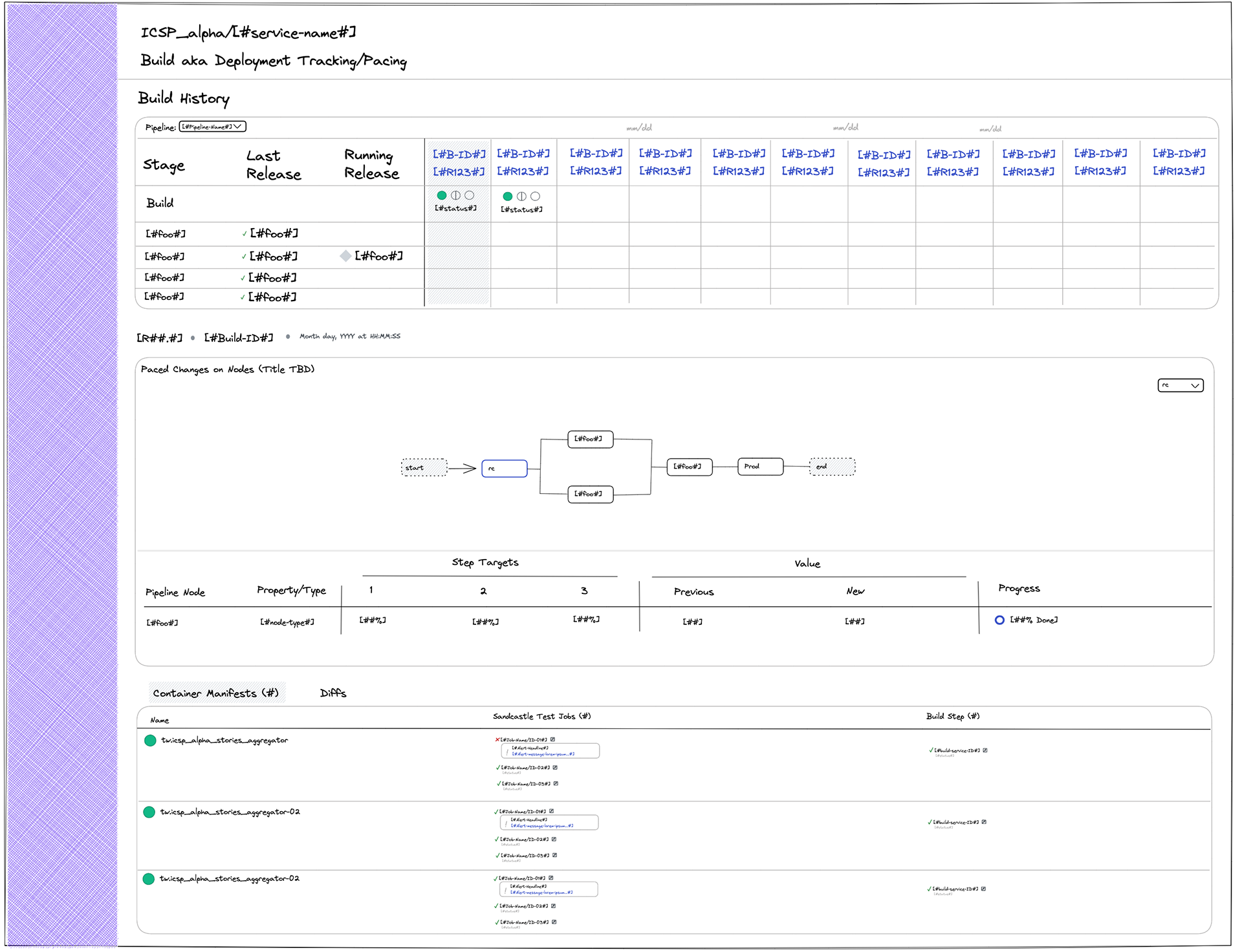
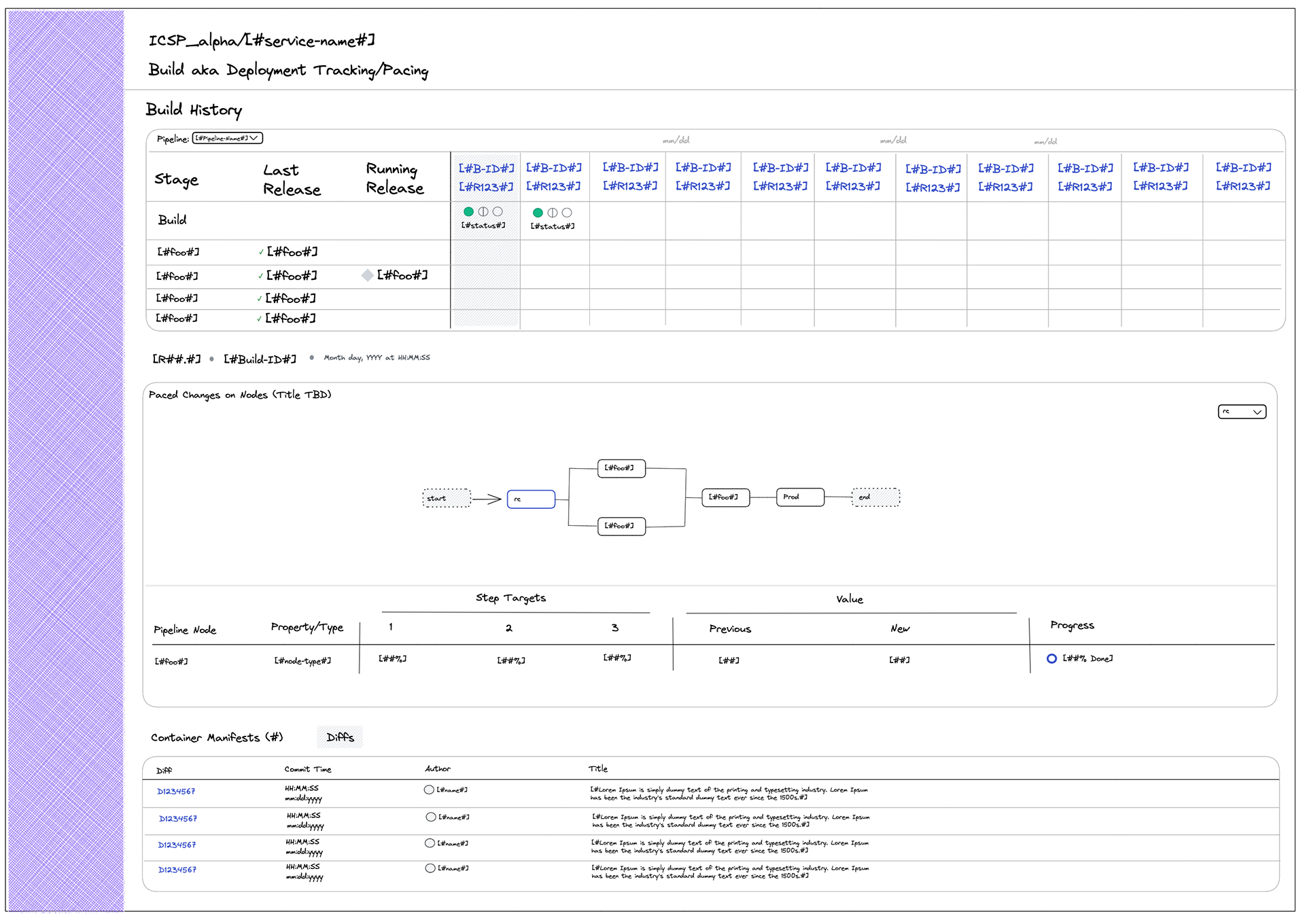
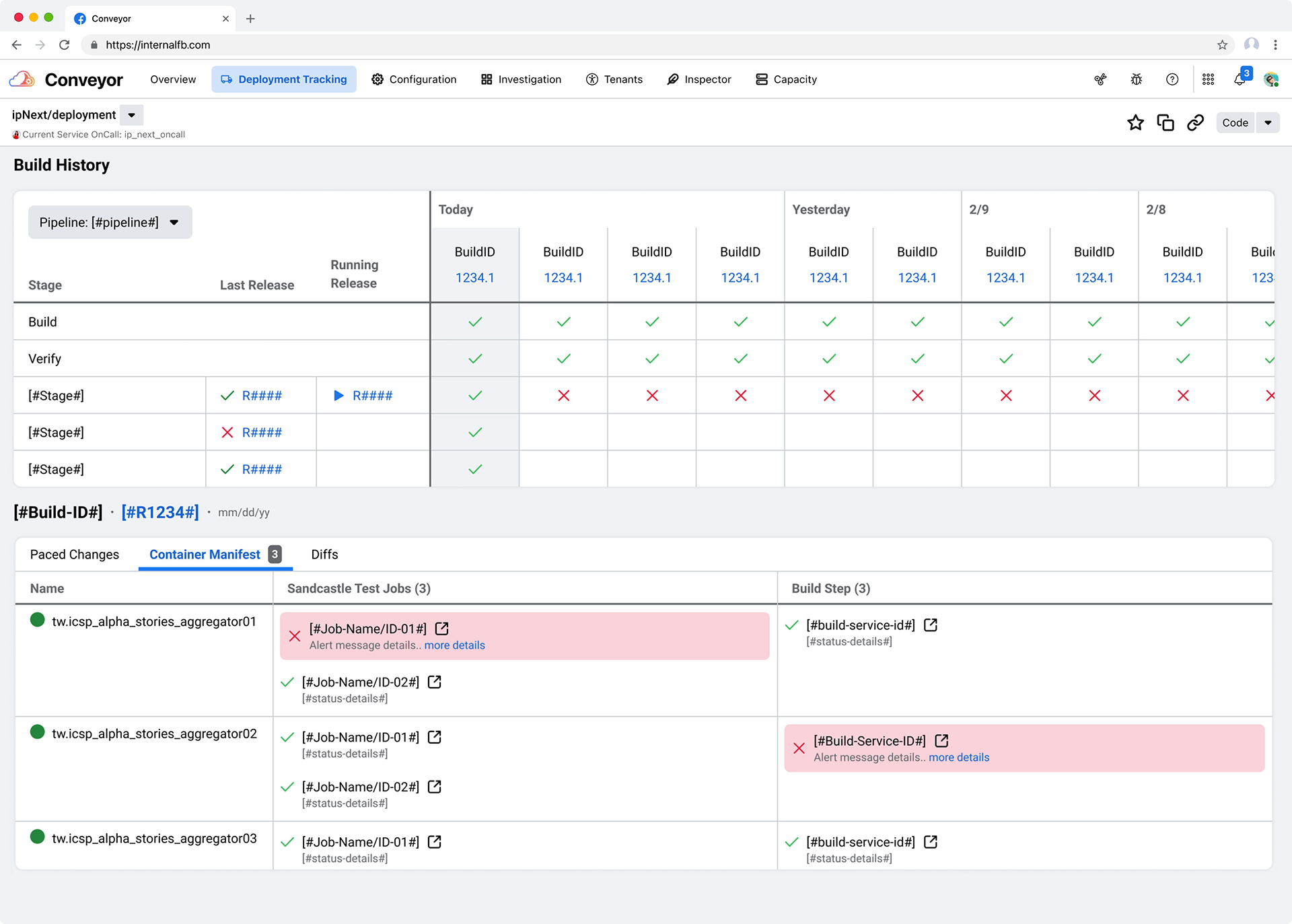
Wireframes for the new Deployment Tracking section can be seen below, which are the first iteration of a complete merge between "Build" and "Ship". Viewing from the top-down, we see the familiar table list history of Releases from Ship; and the Commits from the Build section below working in symbiosis. Also included is a "mental model" illustration of the Nodes (under the "Paced Changes" headline) that the code change moves through in the pipeline during the deployment process - from initial creation to post-landing in Production.
Design Process - Hotfix
Implementing the design for the Hotfix feature was pretty straight-forward because it already existed in the CLI (Command Line Interface) and the feedback collected from users indicated from very clear steps on how it would work. I made the decision to go right to Mid-Fi designs and iterate as-needed.
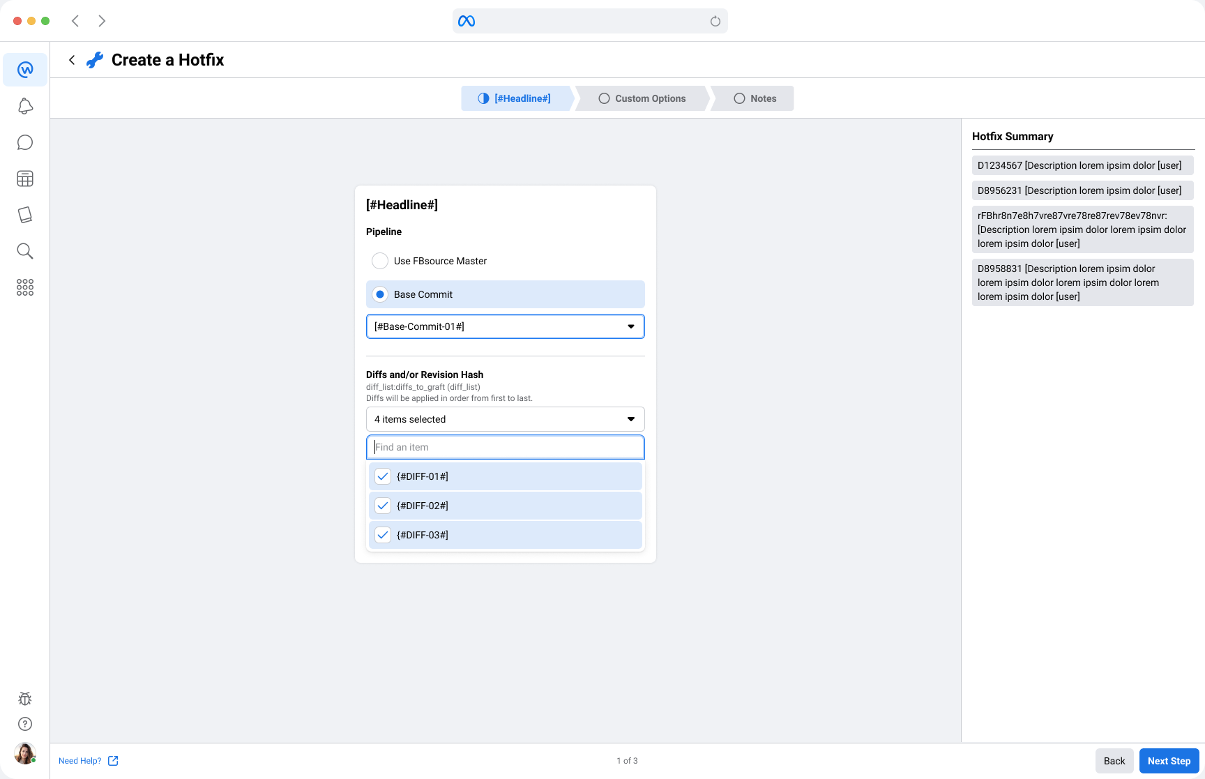
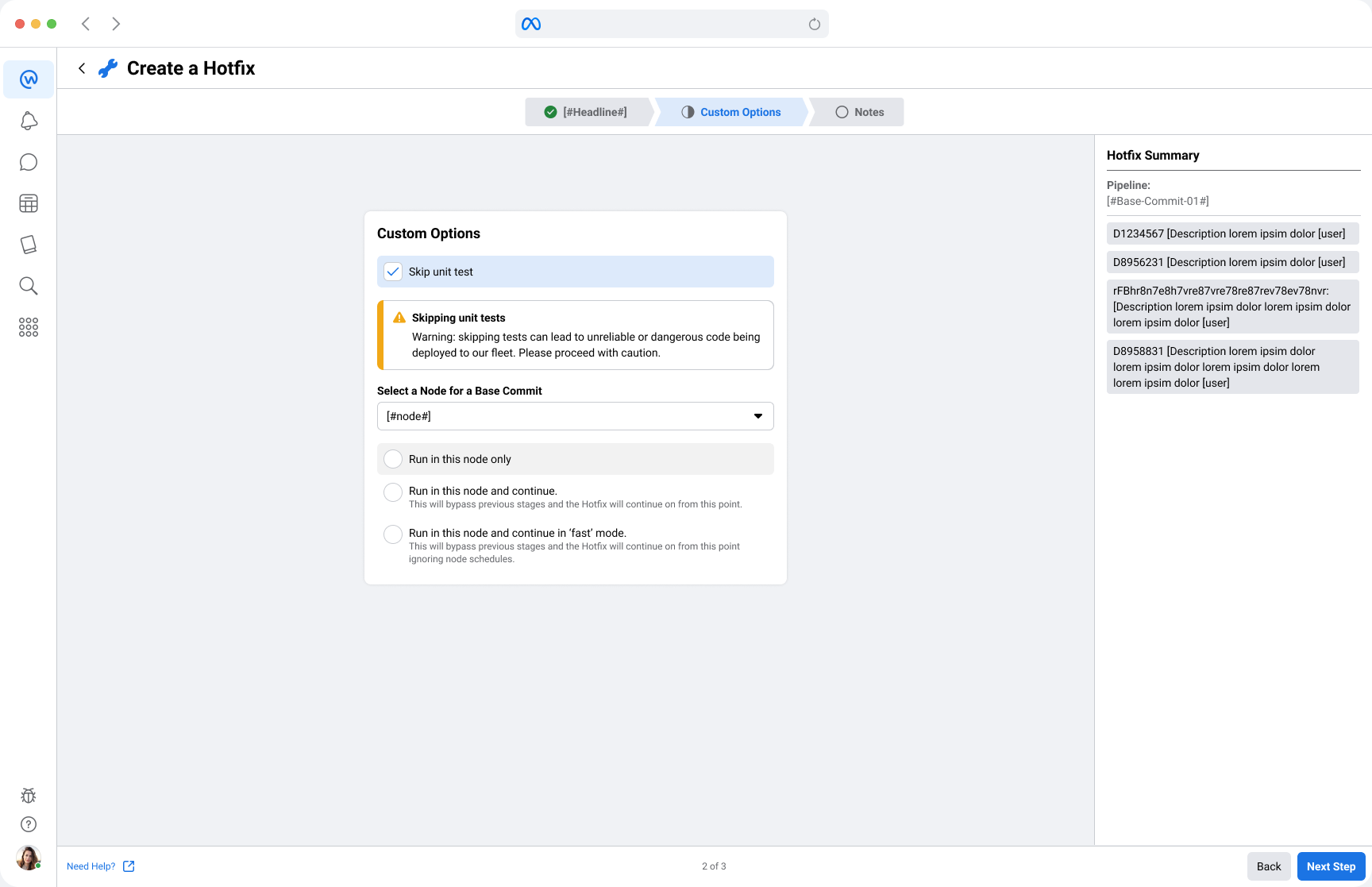
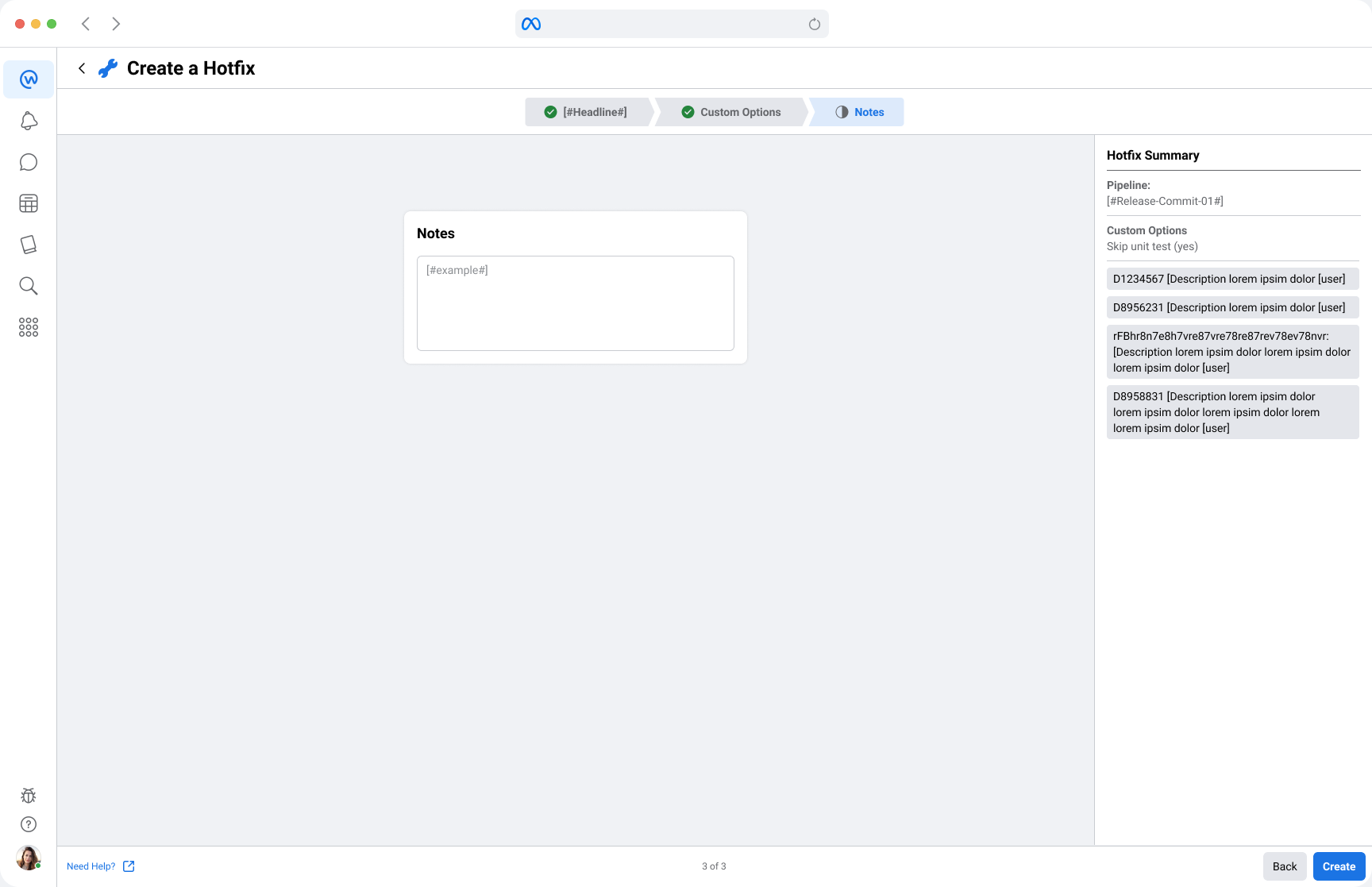
Hi-Fi designs for the Hotfix feature can be seen below. It's a portal-style stepper process in three phases, with the final phase being a summary review of customized options made during the process. Users needed to be able to select a Pipeline to inject the fix, include the actual Diff's where their changes were located; then move into customization options, ending with a Notes section to provide specific details. If all seemed OK, they were notified that the Hotfix has been started ("Build has been started") in the last Step with a matching Build number so that they could track the deployment of that Hotfix in Conveyor.

Design Process - Deployment Tracking
After a complete cycle of wireframe iteration (with approval) we were ready to move to the Hi-Fi stage of delivering the newly-merged Ship and Build page; with a new name - Deployment Tracking (seen below). The term "Paced Changes" surfaced during our many discussions describing how a single change can be literally "paced" through the deployment pipeline; hitting each milestone (aka Node) along the way, eventually landing in Production.
Design Process - Release Details
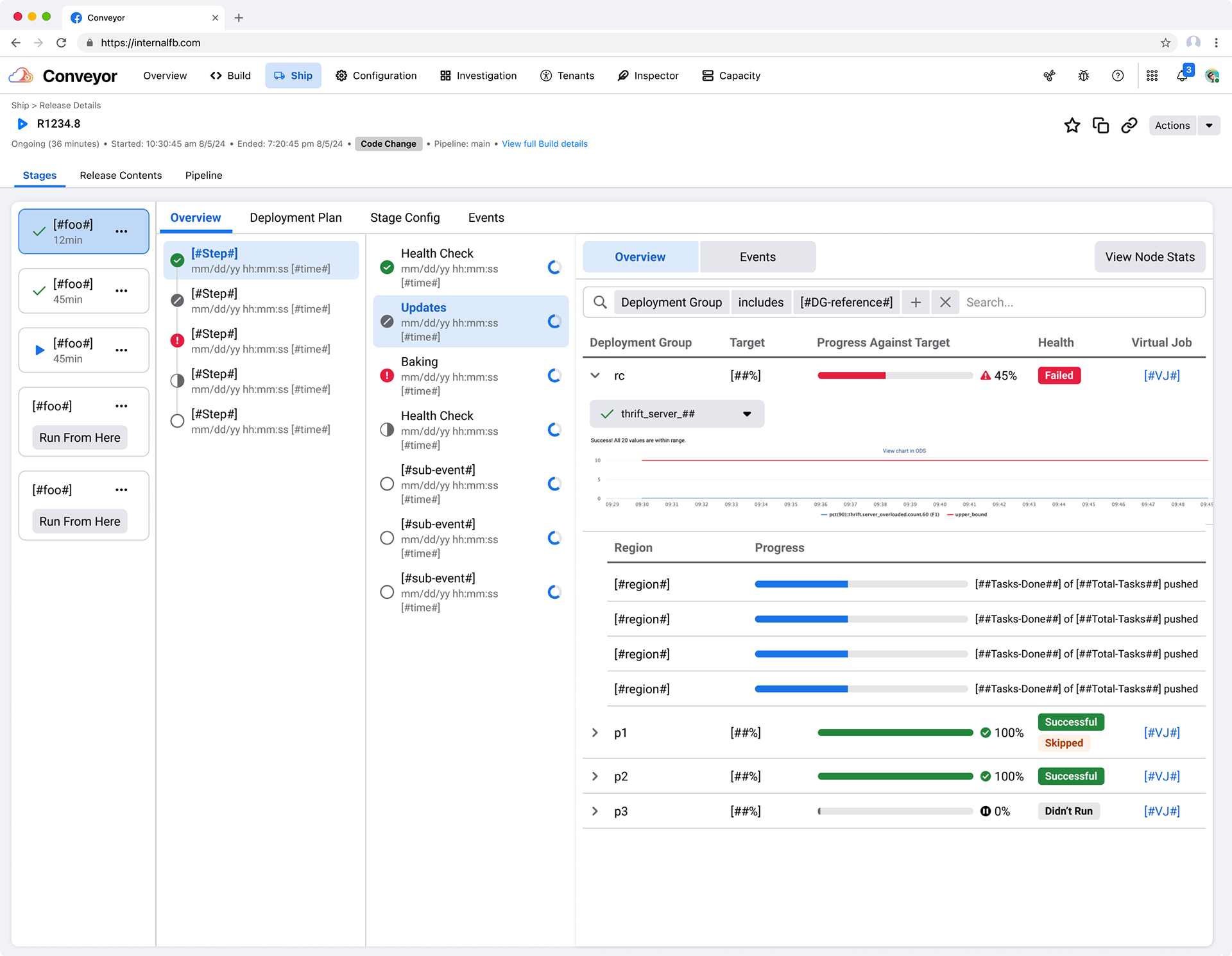
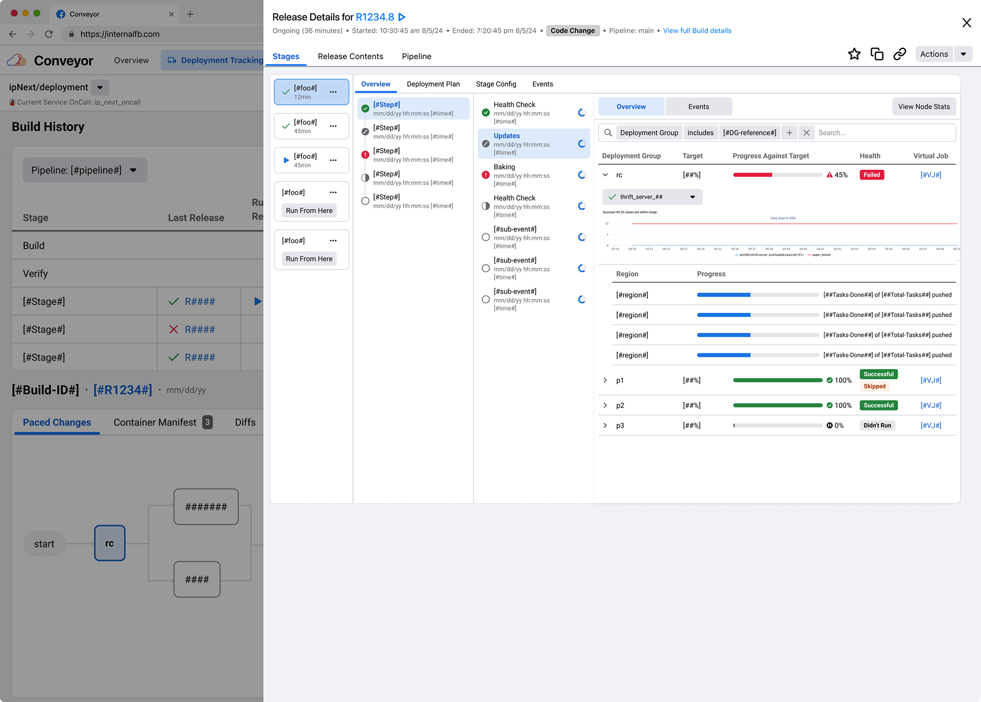
Taking it a step further, I also did a quick Experience Review of the users' path to viewing the specific details of a Release and found the data pretty buried within the tool. Users had to click 4 times to get to the Release details screen (seen below), and then had to click multiple times through layers and layers of data hierarchy (Stages to Steps to Phases to Overview - seen in the below image) when searching for failure data. This added onto the time spent mitigating and investigating a failure which could easily be reduced with a quick re-organization of the data.
Design Process - Release Details Cleanup
I removed an entire click by surfacing the Release details in a slide-in container, directly on the new Deployment Tracking page. This gave everything immediate context and kept the users' perspective relative to the Releases relationship within the ecosphere; while making it more-immediately accessible (as seen below).
Design Process - Release Details Cleanup
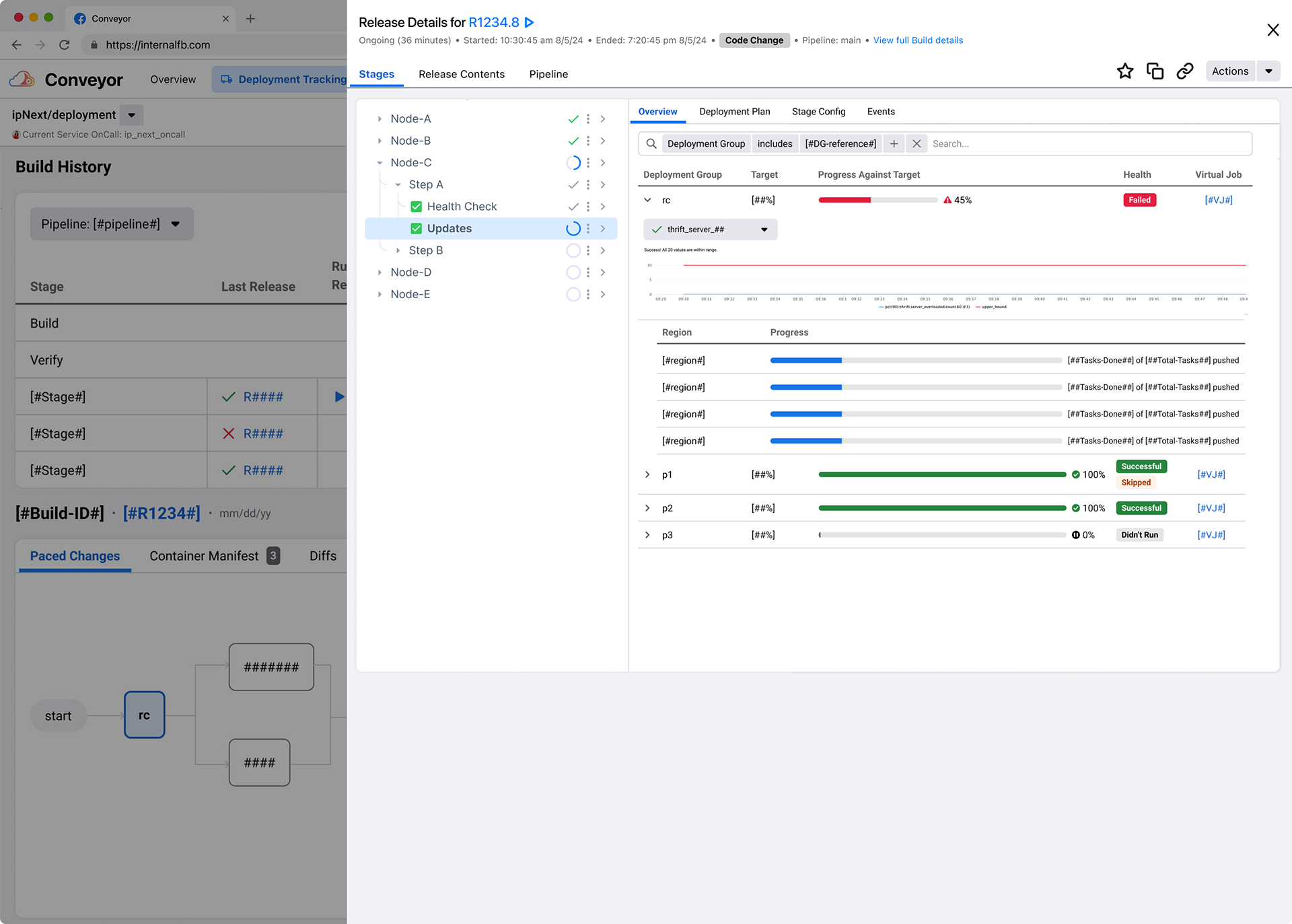
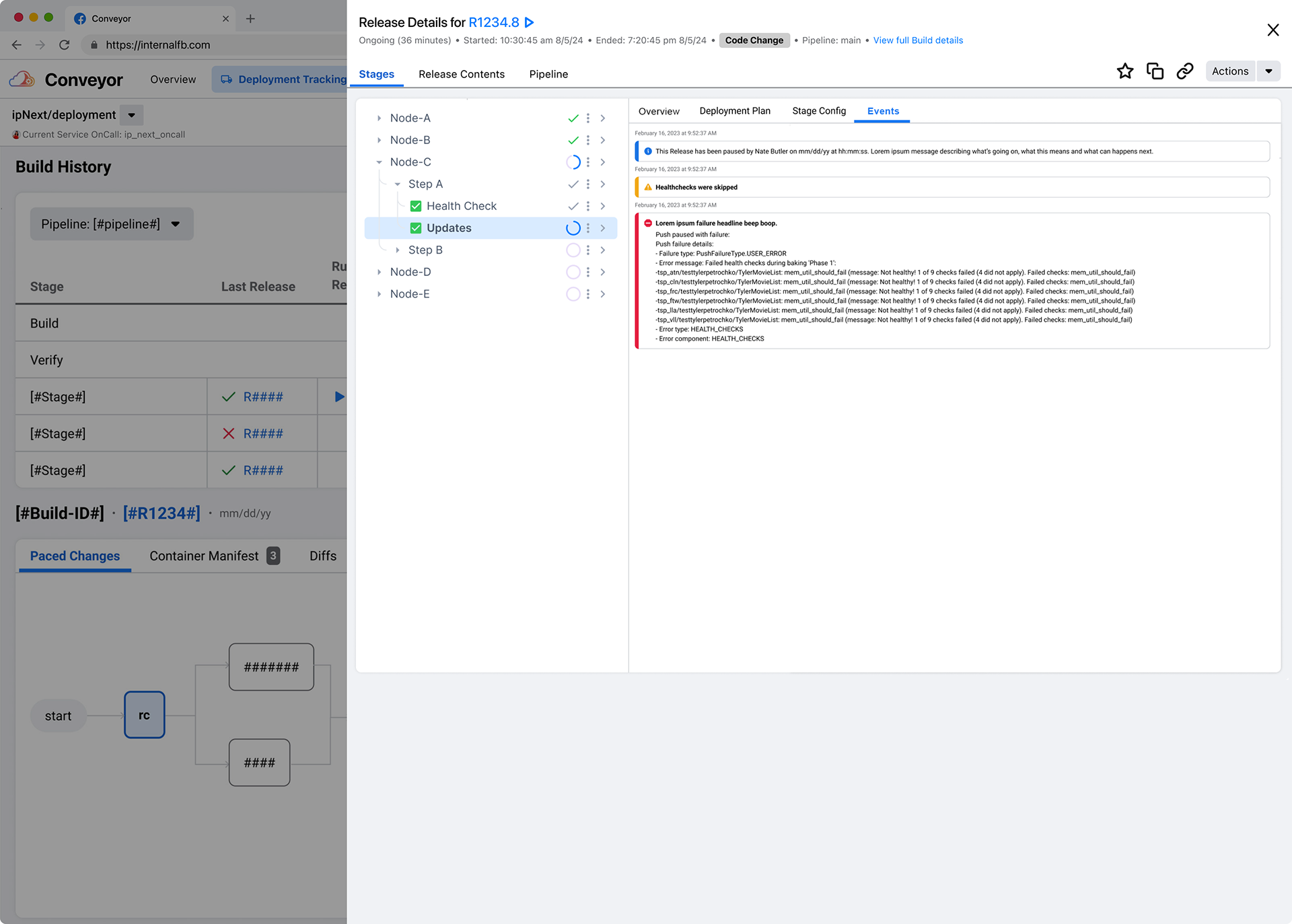
I collapsed the columns of data into a stacked tree-view (as seen below in the left column) with inline icons reporting on the status of the deployment in each Stage - and all Steps and Phases included in an expandable view - so that users could see everything in one view instead of drilling into each one individually. This might have seemed like a large effort for engineering to take on, but these components already existed in the Design library and Conveyor due to previous modularity efforts; so the added effort did not bloat the timeline.
Conclusion - Hitting Impact with Key Results
The redesigned Conveyor interface shortened the timeline for mitigating failures allowing Engineers to work more efficiently and reduced user toil by introducing the Hotfix flow during mitigation events (with ability to track those Hotfixes immediately in the UI).
The design improvements increased overall security in deployment safety by introducing clearer methods of building safer Hotfixes. It enabled Engineers to find everything in one place instead of having to traverse the complicated architecture of the tool; and they could easily initiate emergency Hotfixes.
By consolidating fragmented workflows, the tool now supports more types of users, and surfaced deployment stages in a more efficient manner, while aligning the mental model—enabling clear, end-to-end visibility.
Additionally, deployments of new Releases were improved in terms of self-service efficiency; measured by an 80% reduction in support tickets for the Conveyor Oncall team. This helped foster foundation trust in reliability and safety initiatives within Infra, bridging the gap between design efforts and engineering partnerships.